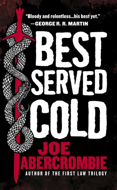
Cover Launch: BEST SERVED COLD
 Now in bite-sized format: the mass market edition of Best Served Cold by Joe Abercrombie. Now even more bad-ass.
I may have gone over this before, but you may ask, “Why would you change the cover from Hardcover to Paperback?” and my answer usually is “Why not?!” — there’s always more than one way to portray the story in a book, and why not take the opportunity to do something new and maybe even attract a few new readers that you may have missed the first time around. There’s some seriously publishing-geeky conversations over here between Editorial and Art about audience, readers, how people browse in bookstores vs. airports vs. bog box chains, etc. but in my book I will usually always go for reshuffling the elements at least — keeping the art, but playing with the crop, size, order, type on a cover. (That is, unless the Creative Director hasn’t had a lot of sleep that week, or some other art emergency is draining manpower when the cover change comes up for discussion, so don’t go back thru the backlist and nitpick me, ok? Ha.)
In the specific case of this book, you may recall there was some serious debate over the cover design for the hardcover (which had much to do with the gender issues and conventions rife in sci-fi/fantasy art) in which there was some insinuation that since we had an icky girl on the cover that the book could not possibly be as bad-ass as Mr. Abercrombie’s fabulous prior books and we were all sell-outs to the urban fantasy machine. (Noting that the main character he wrote was a female, so really, what else were we supposed to do, pretend she wasn’t there?)
Since the hardcover is out now and selling very well (It is a great read, so you should go get the hardcover instead of waiting for this version next year), I imagine Joe’s very dedicated fanbase have come to appreciate, or at least settle for, the hardcover design. So when the chance to redesign for mass market came along, we all agreed here at Orbit HQ that we should just go for an in-your-face, big-red-type, blood-stained, testosterone-sprayed cover with a big bad-ass snake on it (yes, the snake does have to do with the story). Enjoy!

