How to make a fantasy book cover: FADE TO BLACK


It’s finally here! Today is the release date for FADE TO BLACK (UK | US | ANZ) by Francis Knight, one of the most hotly anticipated fantasy releases of the year.
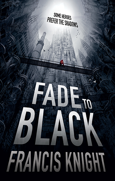
The illustrator for the covers of this series, Tim Byrne, did an awesome job representing the vertigo-inducing city of Mahala, the setting for FADE TO BLACK and all the Rojan Dizon novels. We asked Tim to go step-by-step through the process of creating such a cool image:
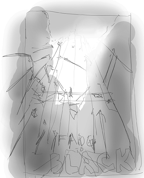
I started off by doing a very quick sketch of the cover to get an idea of how the perspective might work. I wanted to convey the extreme height of the city of Mahala and how it might be if you were at the bottom looking up. I nearly always start a cover by positioning the type – as once I know where and how that is sitting, I know how much space I have left for the rest of the image.
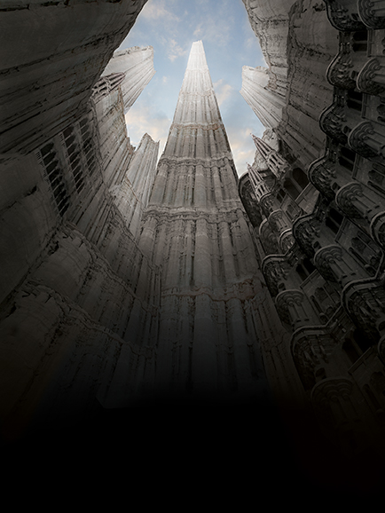
Next I started blocking in the faces of the buildings/vertical streets using an image of a mud face that I had – which I repeated, scaled and distorted in order to get the perspective to work. This gave me a base on which to start adding bits of buildings and windows.
The city was described as being very organic and growing out of the ground in a random way. So I started to break up the regularity of some of the architectural details by overlaying sections of the image with bits of tree trunk, erasing some bits and leaving others. I also added some towers to give a sense of depth and height in relation to the buildings behind.
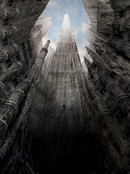
I then took a section of some mud buildings and repeated and scaled it to form the central tower and the sections top left and right. I played about with layer blending and masked some sections, as I wanted some of the underlying textures to come through. I continued to add sections of tree trunk and some rock textures in order to get more of an organic feel to the structures. Then I worked on the lighting of the whole image, darkening some parts of the image and lightening others.
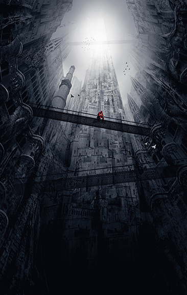
I changed the colour palette as I wanted the image to be more monochromatic and gloomy. I also added in the bridges and birds, increasing the sense of perspective. I cropped and distorted the image, making it thinner and included the figure and the type.
When working on an image I keep everything on layers, often repeating them and using layer masks. I usually work on an image building it up in layers till I get to a point that I am happy with, then I save it as a layered photoshop file and flatten it. I then use that flattened image as the base for the next section of work that I’m doing and repeat the process. This keeps everything flexible – allowing me to go back to previous stages of the image, and it stops each layered file becoming to big and unwieldy.
Lastly I took a section of the central tower and overlaid it on the type using a mask – as I wanted the type to appear a little transparent while still retaining the flexibility to move it up or down if necessary.

FADE TO BLACK (UK | US | ANZ) by Francis Knight is out now. Click here to read the exciting opening . . .