Posts Tagged ‘Book design’

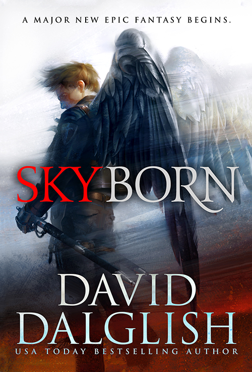
Cover Launch: FIREBORN by David Dalglish

Today, we’re very excited to unveil the newest novel in the the Seraphim series by USA Today bestselling author, David Dalglish.  If you like aerial combat, swords on fire and more than a touch of mayham and war, then this is the series for you.

Dalglish_Fireborn_TP
Art by Tommy Arnold, Design by Kirk Benshoff

Bree and Kael Skyborn have seen their island invaded, their Seraphim disbanded, and their royal family imprisoned.

A rebellion grows from the ashes, demanding Bree to be their Phoenix, their symbol against Center’s tyranny, and for Kael to find the doomsday prophet Johan and sway his cult to their side.

Should they fail, the hope of their rebellion fails with them.

This is the second novel in the trilogy and follows Skyborn, (US | UK | ANZ) which is out this November and it is available for pre-order now. To read more about the cover design process and the art of Tommy Arnold, check out this article.

Dalglish_Skyborn-TP.jpg“David Dalglish’s Skyborn is a compelling story. More than anything it reminds me of the best aspects of the Final Fantasy (ital or no?) games with their flying islands, fast pacing, and tonal mix of sunlight and shadow. Once you pick up Skyborn you won’t want to put it down, as the story carries you along from one high contrast moment to the next. Dalglish has really mastered the art of focusing the reader’s attention. I expect this series to fly off the shelves.”
—Kelly McCullough

“A soaring tale that nails the high notes. Skyborn had me gazing heavenward, imagining what could be.”
—Jay Posey

Cover Story LAZARUS WAR by Jamie Sawyer

I love me a great sci fi novel, and these are great sci fi novels! I got assigned the Lazarus War series by Jamie Sawyer (US UK | AUS)  which is set in a future where mankind battles a hostile alien race. All that protects us are an elite military team, remotely operating avatars in the most dangerous theatres of war.

Lauren had reached out to the ever talented Ioan Dumitrescu to work on the series. Jon took the proverbial bull by the horns and came back with illustrations that blow you away like an old school Maxell Ad. It only seemed appropriate to have the art keep pace with the story, so we wanted movement and action that jumps off the page!

Here’s Jon (Ioan) to talk about the project!

Hi everybody, my name is Ioan Dumitrescu and im a professional concept designer / ilustrator for games and movies.

And sometimes im in that zen zone where i get to do sci fi book covers. This time that opportunity came with Lazarus War by Jamie Sawyer.

Story about incredible space battles between starships and behemoth alien flotillas, plasma shooting crazy dudes, in short an adrenaline rush ride.

My first assignment came from Lauren P, and i was briefed to work around a lead ship. The thing i love about doing book covers is they give me a great freedom to experiment and see where it can take me. The starship was supposed to be a bulky, can take a hit, huge gun/ cannon.

The vibe i followed was to make a very dynamic image, and show a race for life. I took advantage of 3d to get the best angle and shapes. After that the image started coming along, having a huge star like explosion, which i thought would show how anything can happen at any given moment. We also see a glimpse of the aliens, the Krell ( thats a cool alien name) with their smaller needle attack ships, that swarm and overwhelm. The colors of orange yellows described the imeddiate danger the starship is in, but you can also see hints of blue and green at the front which gives hope to escaping alive.Next came the email from Kirk B, saying to start focusing on the second book, which would come down to showing what the Krell are all about, behemoth motherships, 10 times the size of the starships, that deliver thousands of expendable attack ships. Process was similar, using 3d to decide on the best angle. I wasnt ready to give up on the dynamic action packed feeling, and i also wanted to be different from the „all out” first cover.I decided to show the moment before the Krells choose and attack their targets. Having left the last battle in the background, now stands the mothership, in all its biomechanic glory, in a somehow proud stance, a relic of times unknown, that conquers everything it sets it sight on, no fear, no emotion. I choose to make it a bit more slimy and also a small tribute to the genius of H.R Giger. It just felt right! All the attack ships are waiting to jump at their target when given the order! Tension in the air treated with an unearthy like calm. The colors followed that feeling, having the ship wrapped in serene white light and surrounded by blacking greens. The touch of red is also a sign of the carnage that might follow.

This can now only get me thinking of what might be the 3d book cover, im thinking of something more intimate, that would bring the viewer and reader closer to the characters that take the action further.

I hope you enjoy the past and future covers to come!

Thank you
Ioan Dumitrescu

So, without adieu, I’m thrilled to present the covers to the first two books in the Lazarus War series by Jamie Sawyer!


Sawyer_LazarusWarArtefact-EB
Sawyer_LazarusWarLegion-EB


The Lazarus War: Artefact and The Lazarus War: Legion is out now!

A CROWN FOR COLD SILVER: The Making of the Map

Welcome to a behind-the-scenes post on how maps get created in the Orbit universe. I thought A CROWN FOR COLD SILVER (US | UK |AUS) was the perfect opportunity to do a write-up on, because the map design even made it to the cover. I’ll be your narrator, and welcome Author Alex Marshall, and illustrator Tim Paul.

LP: People often ask how we decide which books are going to have maps, and most times it is author-driven. Some authors use mapmaking as part of their worldbuilding process, and some authors only have a more general idea of geography as they’re writing. If a map or diagram comes naturally out of a story, then I always like to create something to expand the reader’s experience of the book. And sometimes a “map” is not really a map – for example we’ll be doing a process post soon on BLACK WOLVES (US | UK | AUS) by Kate Elliott – that book has tattoo designs for each important clan in the book in lieu of a geographic map.

In the case of A Crown for Cold Silver, I knew the author had a very specific concept for the map, and when I want the author and map maker to work together directly, my go-to artist is Tim Paul. I’d actually known Tim for a few years for his more stylized illustrations. One day we were sitting at the Society of Illustrators in NYC, at some art event or another, and he was saying he was dragging out all his old Dungeon Master props and maps to start up a Dungeons & Dragons campaign. He was talking about how much he enjoyed geeking out on the mapmaking, and my head snapped over to him and I said, so….you like making maps huh? Have you ever illustrated one for a client? (See, networking is real!)

TP: Hurray for networking, and talking about yourself!

LP: Map illustrators are a special – and rare – breed. You have to really be into the process of drawing the map out of the author, and tolerate a lot of fine-tuning. If you aren’t really excited by that, then you burn out quite quickly on all the revisions. You have to love the collaboration process. Many illustrators feel map work isn’t as creative as other types of illustration, but good mapmakers know there’s a lot of room for artistic license.

TP: It’s true about being a rare breed. I’ve had lots of illustrators tell me they won’t touch maps, and those few that do try, end up deciding not to do them again. As one person described, it’s like doing 50 – 100 little illustrations that are always changing. I actually find drawing thousands of little trees and mountains relaxing, even as I strive to make each mountain unique.

I’ve played D&D since I was 14. The maps in the books and modules were one of my favorite aspects. As a kid, I always made my own maps and worlds. Surprisingly, it took a long time to put my love of making my own maps into another way to making a living with my art. (more…)

How to make a fantasy book cover: FADE TO BLACK

It’s finally here! Today is the release date for FADE TO BLACK (UK | US | ANZ) by Francis Knight, one of the most hotly anticipated fantasy releases of the year.

The illustrator for the covers of this series, Tim Byrne, did an awesome job representing the vertigo-inducing city of Mahala, the setting for FADE TO BLACK and all the Rojan Dizon novels. We asked Tim to go step-by-step through the process of creating such a cool image:

I started off by doing a very quick sketch of the cover to get an idea of how the perspective might work. I wanted to convey the extreme height of the city of Mahala and how it might be if you were at the bottom looking up. I nearly always start a cover by positioning the type – as once I know where and how that is sitting, I know how much space I have left for the rest of the image.

Sketch by Tim Byrne for FADE TO BLACK by Francis Knight, the first Rojan Dizon novel and a highly anticipated fantasy debut

Next I started blocking in the faces of the buildings/vertical streets using an image of a mud face that I had – which I repeated, scaled and distorted in order to get the perspective to work. This gave me a base on which to start adding bits of buildings and windows.

Stage 1 of a cover by Tim Byrne for FADE TO BLACK by Francis Knight, the first Rojan Dizon novel and a highly anticipated fantasy debut

(more…)