Moorehawke Artwork.


When Orbit asked would I do some limited edition artwork for the UK release of The Crowded Shadows I was more than happy to oblige. I always draw when working on a book. I draw the characters, I draw scenes from the story, sometimes I even do wee comic strips. It’s my way of blowing off steam when writing is stressing me out. So, as you can imagine, I’ve been drawing the Moorehawke characters for years at this stage, and I’ve a pretty clear picture in my head of how they look.
If you’re interested, I thought I might walk you through the process of doing a drawing?
I’m a classical character animator by trade, so my drawing process is very strongly grounded in the techniques which I learnt at the animation board. I also use the same techniques and the same tools for my graphic novel work. It’s quite time consuming, very painstaking and slow, but it’s the only method I’m happy with.
Here’s how it goes.

The first thing I do, is clear my drawing desk, and fill it with relevant images. In this case I went though my many drawings of Wynter and chose those which best reflect my image of her. Wyn went through a few changes over the years, but she has long ago solidified into the girl you see in these images – a strong, almost roman nose, large eyes, masses of red hair like her father. A short girl, with a curvy figure and quite muscular arms.
Surrounding my drawing with images like this, provides me with reference that helps me keep the character consistent. If I were working on a Moorehawke graphic novel, I would gather all these images onto one convenient page called a ‘model sheet’. There would be several model sheets for each character and I would refer to them constantly as I drew – but for this I’m happy to just pin up loose sheets.
The preliminary layer of my drawing is always done with a graphite stick.

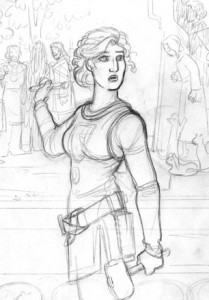
I use a ‘B’ which is medium softish, and as you can see I keep it very very blunt. It’s like drawing with a lump of cheese sometimes, but I love to do my first level of drawing with this – it keeps my hand free and stops me from getting bogged down with details while I get the line of action, expression and balance right. Sometimes – like with these drawings of Hallvor and of Ulfnaor – I put in a few loose details with a blunt pencil and leave it as a finished piece – it’s a look I really like.
To the right you can see the graphite level of the Moorehawke drawing. It’s just the begining.
The second level is done with a non photographic blue pencil.

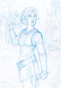
I place a fresh sheet over the graphite drawing and trace over it. Because I spent the first stage of the drawing getting the proportions down and making sure everything works as a cohesive unit, I now feel free to get close to page and really concentrate on the details. This is when the work gets tight. I keep the pencil sharp, I draw eyelashes and hair and buckles and woodgrain – all the picky little things that I need to get down before I start inking.
Unlike graphite, blue pencil is (mostly) not picked up by the scanner. This means I can ink straight down onto this drawing without worrying (too much) about having to erase the pencil.
To the right you can see the blue sketch level of the Moorehawke drawing. Everything should be pinned down at this stage, leaving me free to concentrate on the quality of line and balance of light and dark.
Next I ink.
There are many different stages to the inking process. Each stage is scarier than the one before, because with each layer of ink you risk pushing the drawing too far and loosing the freshness of line. But without the gradual build up of depth and weight your line can look dead and the work unfinished. The inking process can take a couple of days and as I work it through, I may notice things I don’t like about the pencil drawings ( in this case Wynter’s chin and jaw were much too heavy so I pared them down. Similarly I played with her cuffs and with the way I’d drawn her feet.

Here are two different stages of the inking. The drawing above is just a first go around with a felt tipped pen. See how all the lines are basically the same weight? They all have the same thickness and depth? This makes the drawing feel flat and a little dead. Below you can see how the same drawing looks after I’ve built it up with the brushpen, adding weight and shadow. The varying thickness and flow of the brush line adds life to the drawing and makes it breath. Here too is when I fill in the BG, it was a juggling act trying to get the right amount of background detail without shifting the focus from Wyn.

Finally, I scan the finished inks, clean them up in photoshop (up the contrast mostly – erase any lingering smudges of pencil) For this piece, I drew and overlaid an intricate border, and tweaked the desecrated wood a little more – adding some new elements which gave greater depth to the gouges over Alberon and Oliver’s carved figures.
And that’s it!
I hope you like this :) It was fun to draw. In celebration of the publication of The Crowded Shadows, Orbit are releasing a limited edition print run of ten signed copies – stay tuned to the blog for details.
By the way, the movie below tells the story of the drawing from beginning to end. If you like, you can right click and press ZOOM IN, then drag the picture around to see the progression of which ever section you like.
[kml_flashembed publishmethod=”static” fversion=”8.0.0″ movie=”/banners/Desecrate3.swf” width=”620″ height=”900″ targetclass=”flashmovie”]

[/kml_flashembed]